DISNEY+ © Brand Identity™
Logo Refinement
Brand Design
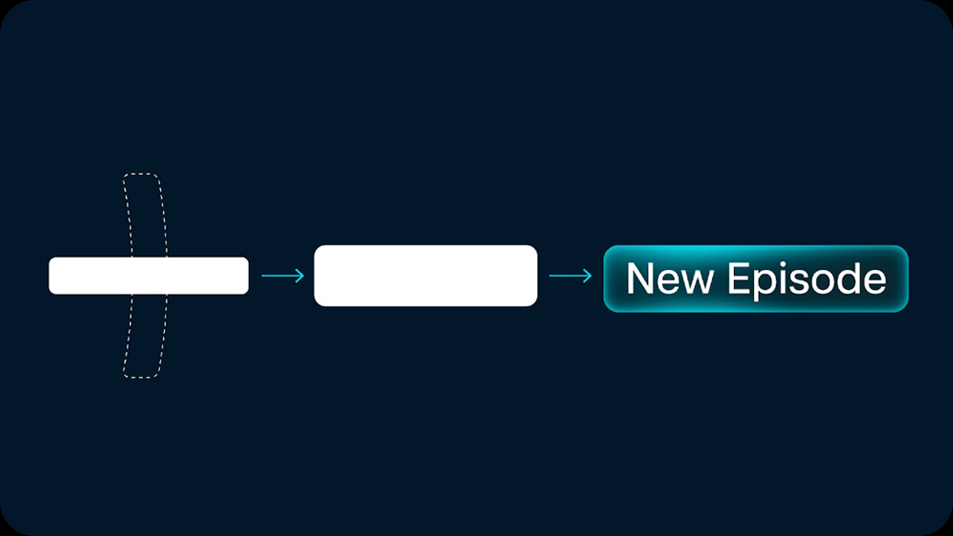
Motion Language
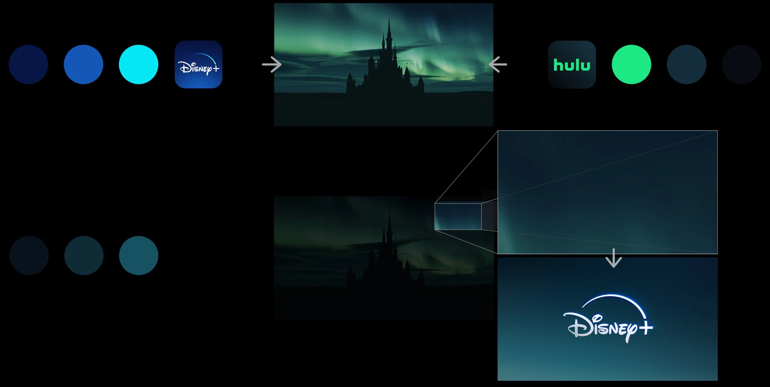
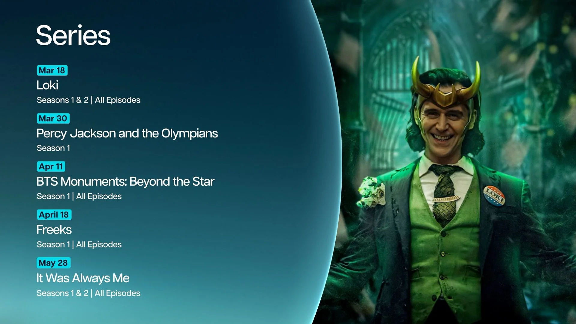
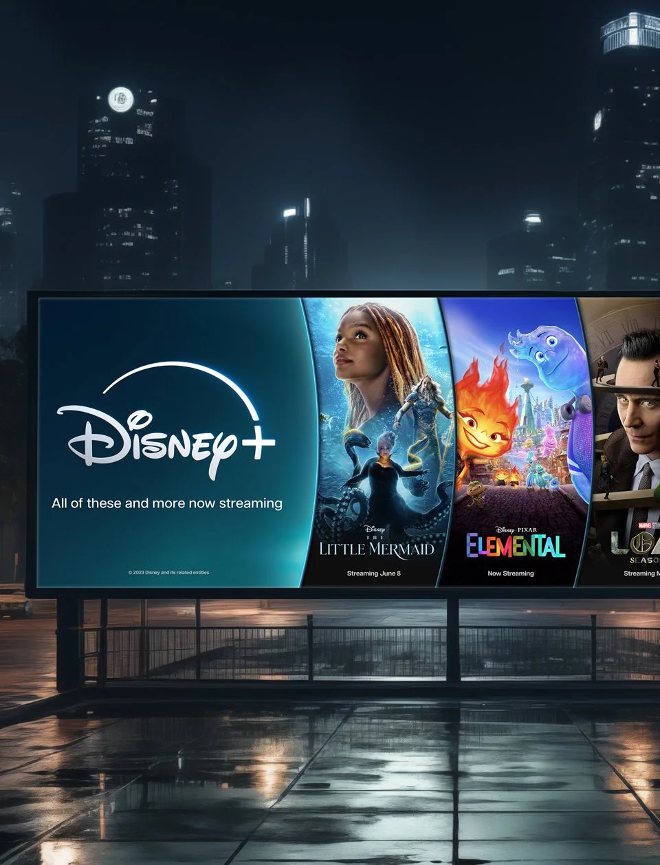
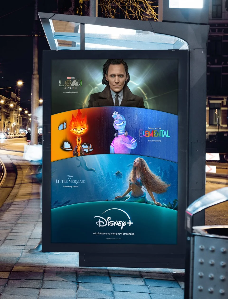
The addition of Hulu content presented an opportunity for Disney+ to evolve, to stretch beyond the blue box, and to shift the perception into a more grown-up, premium brand.
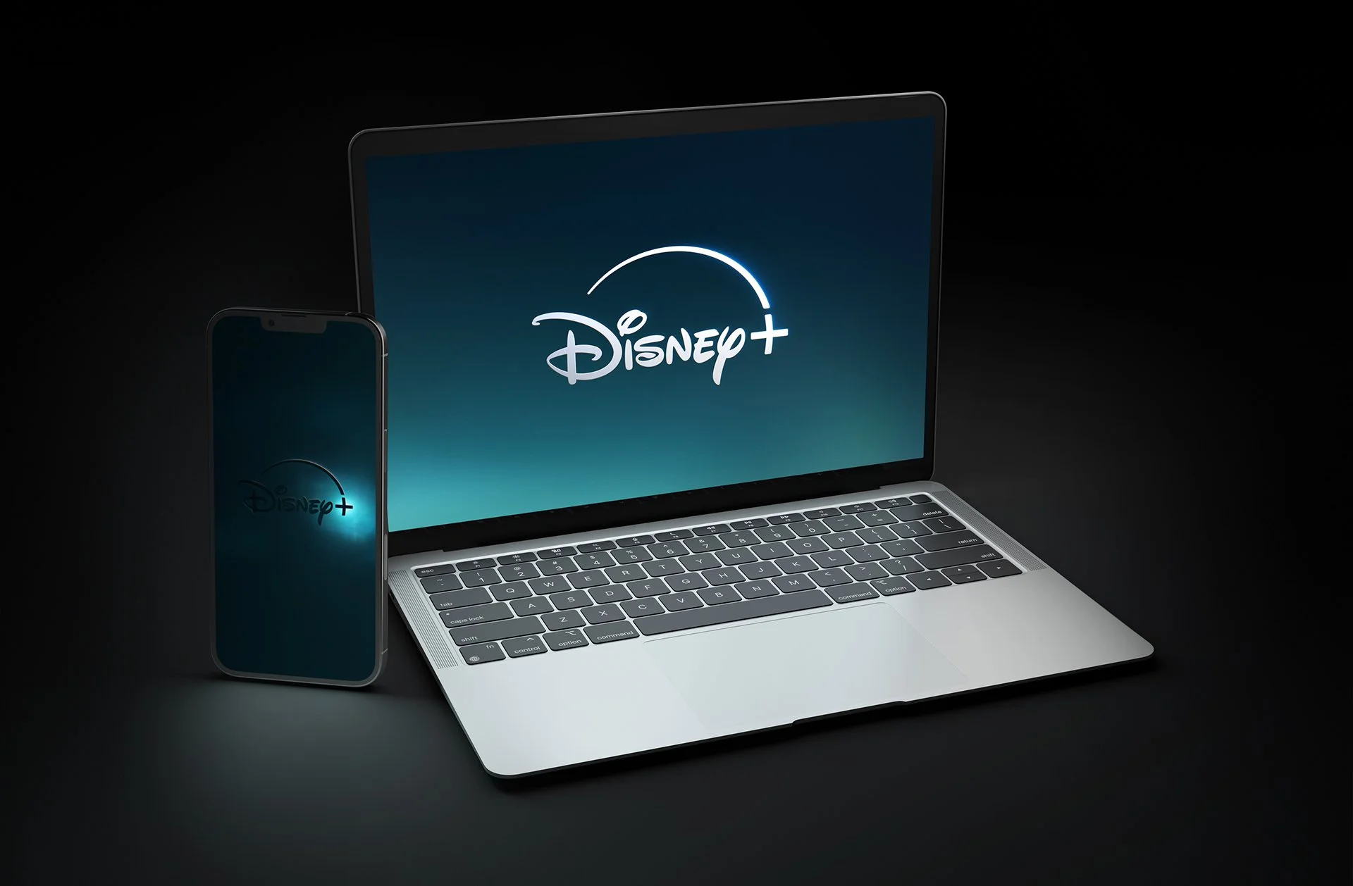
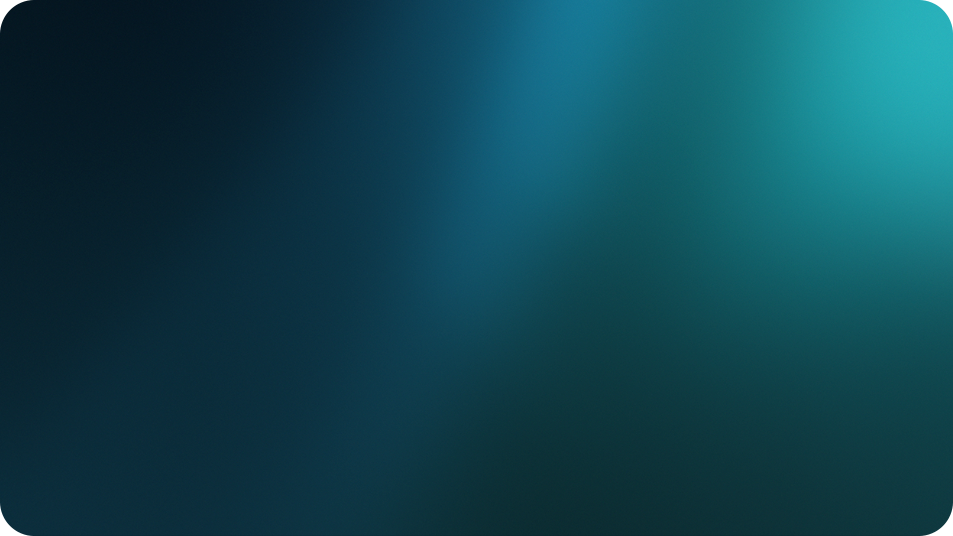
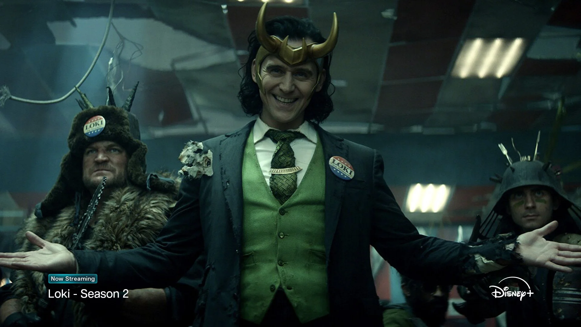
We simplified, streamlined, and strengthened the logo for more consistent implementation across all media. We also evolved the overall color palette to be more premium and cinematic, inspired by the magic of the night sky and the dream-like colors of the Aurora Borealis. We call our signature color “Aurora” – like the name for Sleeping Beauty herself, it evokes both the legacy of the Disney brand and the phenomenon from which it takes its name.
Previous
New
“We think we’ve found a balance of new and nostalgic that helps strike a chord that Disney+ has all the things you love about Disney, but is also evolving and adding new things to love, too.”
Pure White
Bright Aurora
Aurora
Dusk
Twilight
Background 01
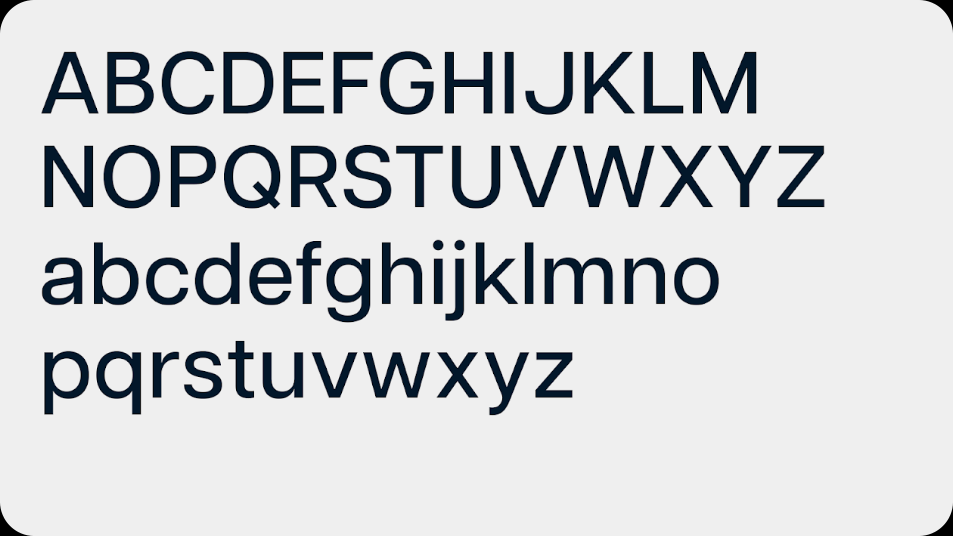
Articulat CF Light
Containers
Background 02
Articulat CF Medium
Dividers
Background 03
Articulat CF Bold
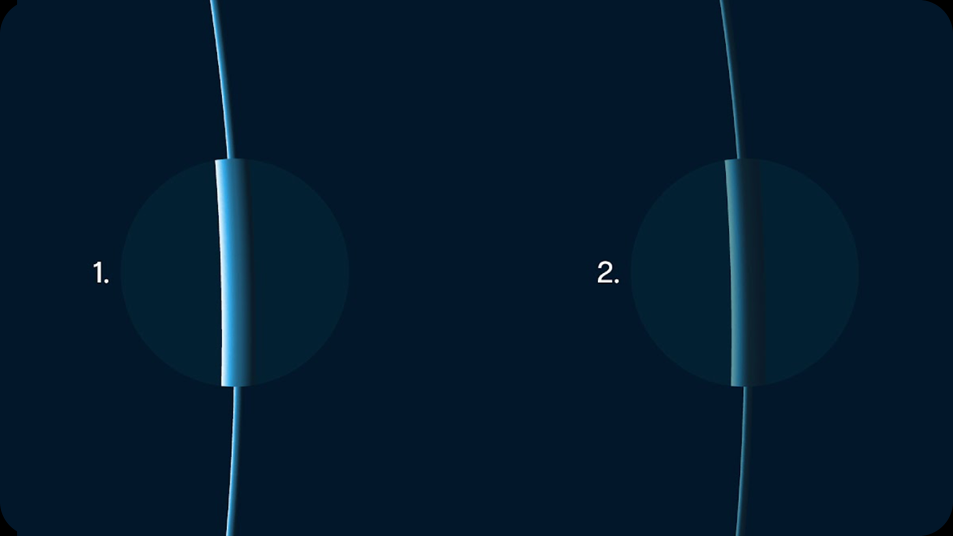
Slab
Previous
New
“The branding change was an eight- to nine-month process from start to finish, with the company ultimately working with agency Loyalkaspar on the final design. The agency had a way of ‘telling the story in the design,’ George said, and Disney wasn’t looking to play it safe.”
Press
The Real Story of Why Disney+ Changed Its Logo: A 'Different Time of Night'
The new Disney+ logo is a beautiful compromise


